- 首页
- International
- 艾特奖
- 文化节
- 服务体系
-
网站导航
设计说明:
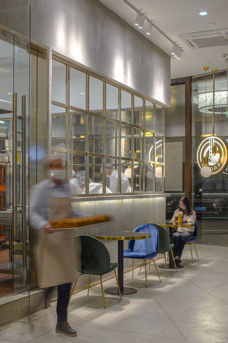
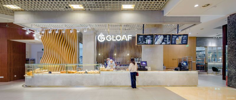
设计师整体形象建议,将人行道空间及立面合并规划,重新建立独特的视觉形象,并利用设计手法留住行经者及车流的目光,由外向内延伸,让品牌包装及空间呈现完美结合。整合了零售与商场体验,采用“波浪思维”来向过往行人映射面包及饮料。设计师将最原始,最能呈现材料“本质”的基本素材运用在空间中,水泥粉光柜体留有制作时空气中的味道,湿度,声音,光线,铜材料的运用,突出产品的质量跟品味,空间以产品呈现为空间中心,让出更多的动线空间给来访的顾客,将路人跟车辆经过的视觉高度合并思考,从展示平台到餐饮高度设定水平基准,以钨丝灯泡,玻璃创造独特的设计灯饰,让空间更具精神。由本质出发,创造涵养,于是,有了Gloaf
The overall image of the designer suggests that the space and facade of the sidewalks be merged and planned to recreate a unique visual image and use design techniques to retain the eyes of the walker and the traffic flow, extending from the outside to the inside, so that the brand packaging and space are perfectly integrated. Integrated retail and shopping experience, using wave thinking to map bread and drinks to passing pedestrians. The designers use the most primitive and most basic material that can present the material essence of the material in the space. The cement powder cabinet retains the taste, humidity, sound, light, and copper materials in the air during production, highlighting the quality of the product. With taste, the space is centered on the product, allowing more space for visitors to visit, reflecting the visual height of passers-by and the vehicle, setting the horizontal reference from the display platform to the height of the dining room. , Glass creates unique design lighting, making space more spiritual. Starting from the essence, creating conservation, so, with Gloaf


